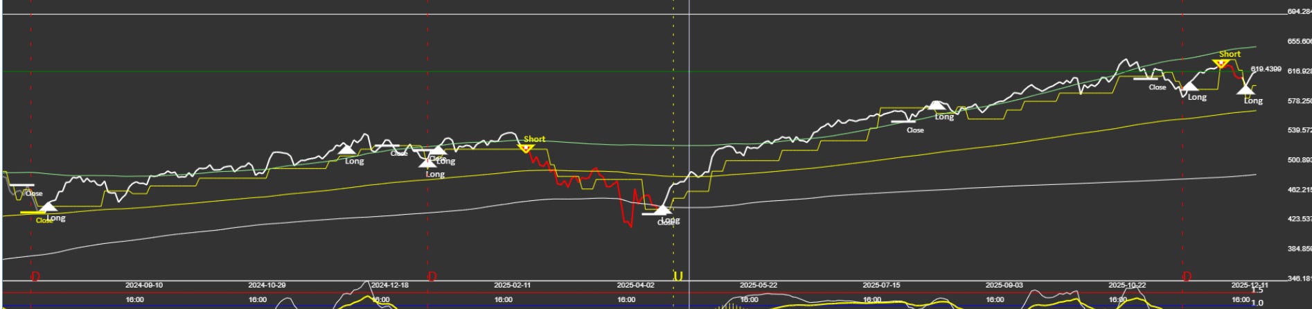
At first glance, this QQQ daily chart looks uneventful.
Price is still trending higher. Pullbacks look contained. No dramatic breakdowns. No panic.
And that’s exactly why this chart matters.
The surface narrative vs. the structural message
Most commentary around QQQ right now falls into one of two camps:
“The trend is still up, just buy the dip.”
“Momentum is weakening, a larger correction is coming.”
Both focus on opinions.
This chart, instead, is telling us something more specific:
The market is transitioning — not reversing.
What has already happened (without headlines)
Let’s start with facts the chart already confirms:
A meaningful drawdown occurred earlier in the year
That decline resolved, not expanded
Price reclaimed structure before momentum fully recovered
This matters.
In many failed rallies, price moves first — and then gives it all back once indicators roll over. That didn’t happen here.
Instead, the decline reset internal conditions without damaging the longer-term regime.
Why the current “Buy” signal matters more than it looks
The current daily signal flipped back to Buy at a point where:
Price is above the long-term trend structure
Momentum is no longer accelerating downward
The system is no longer in a defensive posture
Importantly, this signal did not appear at an emotional low.
It appeared after:
Volatility cooled
Downside pressure was absorbed
Structure stabilized
That’s usually where durable trends resume — quietly.
This is not a breakout environment
One mistake traders often make here is expecting fireworks.
This chart is not pointing to:
An immediate vertical move
A momentum chase
A high-volatility expansion
Instead, it’s pointing to something far more common — and far more profitable over time:
A controlled continuation phase.
These phases feel boring. They also tend to be where most relative outperformance is generated.
Why this environment confuses discretionary traders
In environments like this:
Bears don’t get follow-through
Bulls don’t get excitement
Indicators look “mixed”
That’s because this is a structural market, not an emotional one.
When markets are driven by structure:
Signals matter more than narratives
Risk management matters more than conviction
Patience outperforms prediction
What this chart is not saying
Just as important — here’s what the chart is not telling us:
It is not signaling a major top
It is not signaling runaway momentum
It is not inviting leverage or urgency
This is not a “do more” signal.
It’s a “stay aligned” signal.
The takeaway
The most useful charts are rarely dramatic.
They quietly answer one question:
Has the market earned the right to continue allocating capital?
Right now, this QQQ daily chart says:
The prior reset has completed
The trend structure remains intact
The burden of proof has shifted away from defense
That doesn’t guarantee outcomes. Nothing does.
But structurally, this is what continuation looks like before it feels obvious.
This is not a trade recommendation. It’s a structural observation.
What’s next
In a future post, I’ll contrast this daily structure with shorter timeframes — and explain why conflicting signals across timeframes are not a problem, but a feature.